

Project Overview
Pretty Inn Pink was developed as a fully investment-driven short-term rental built specifically for group travel in a high-energy, celebration-focused market. From the beginning, the strategy was not to create a neutral or broadly appealing space, but to design with extreme clarity around a specific guest avatar and booking behavior.
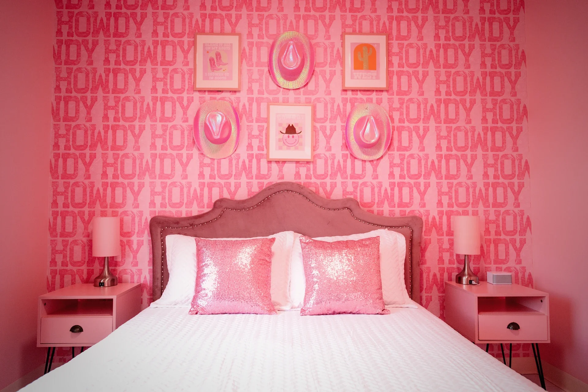
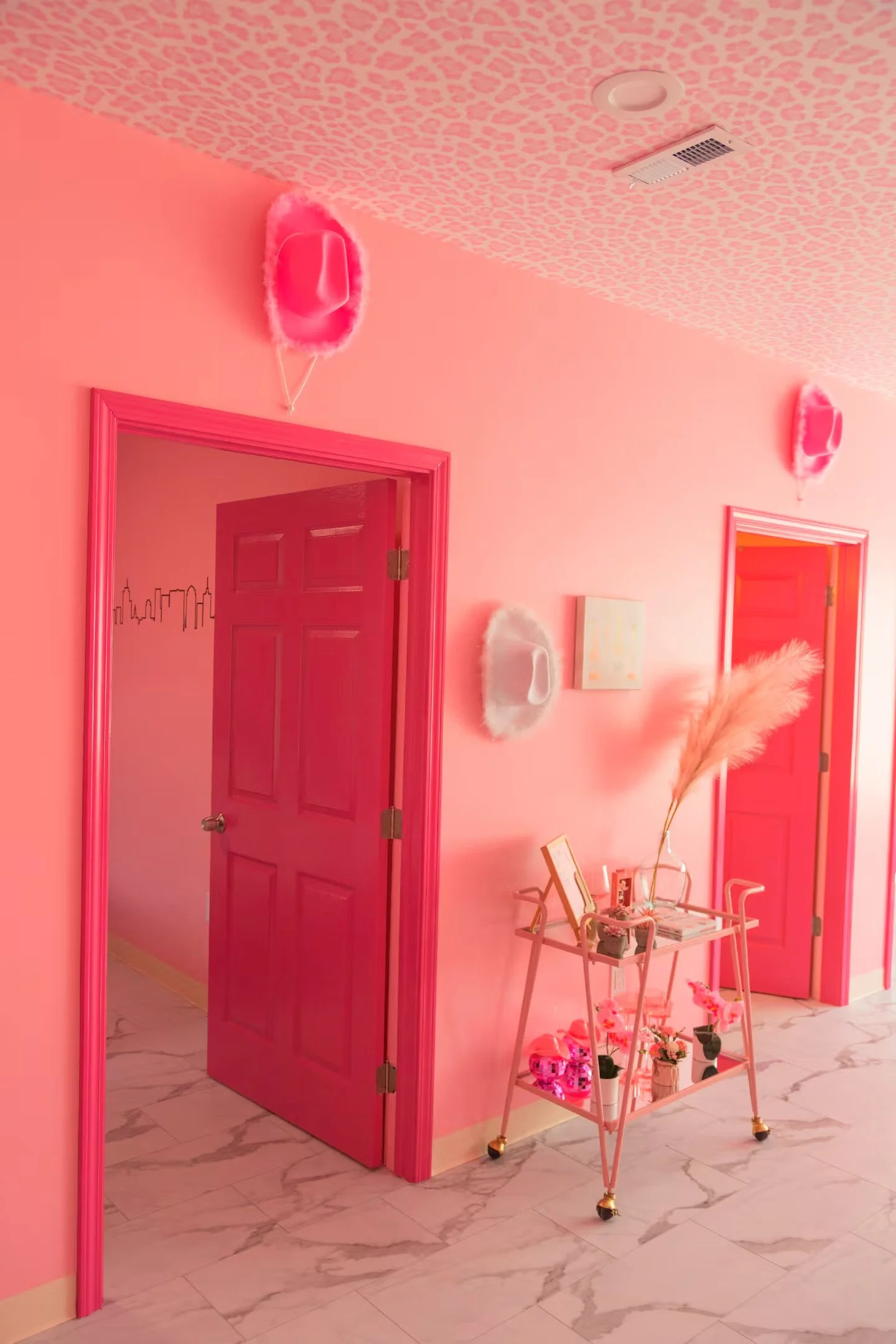
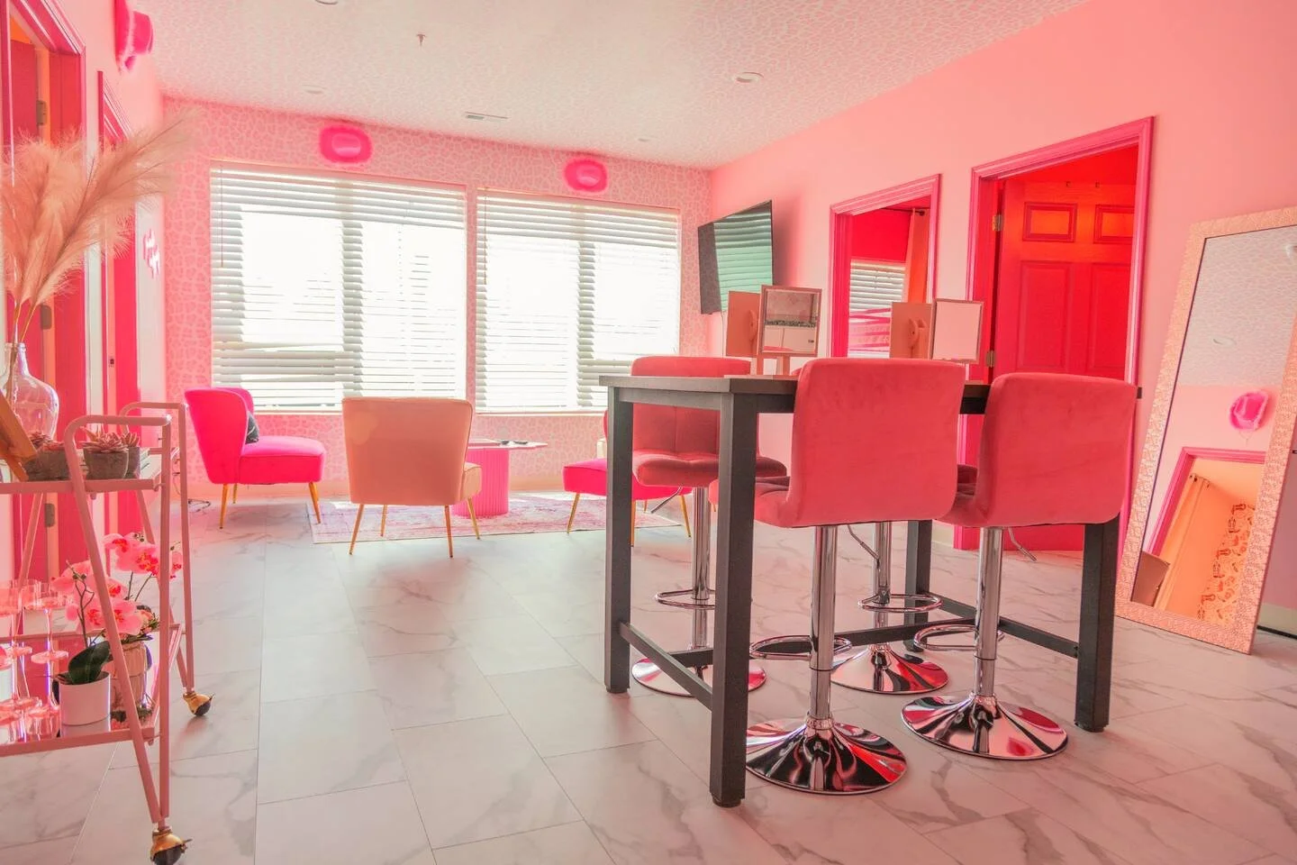
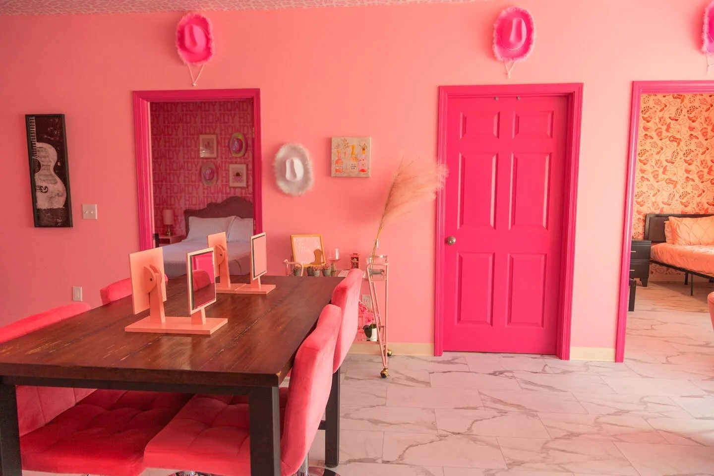
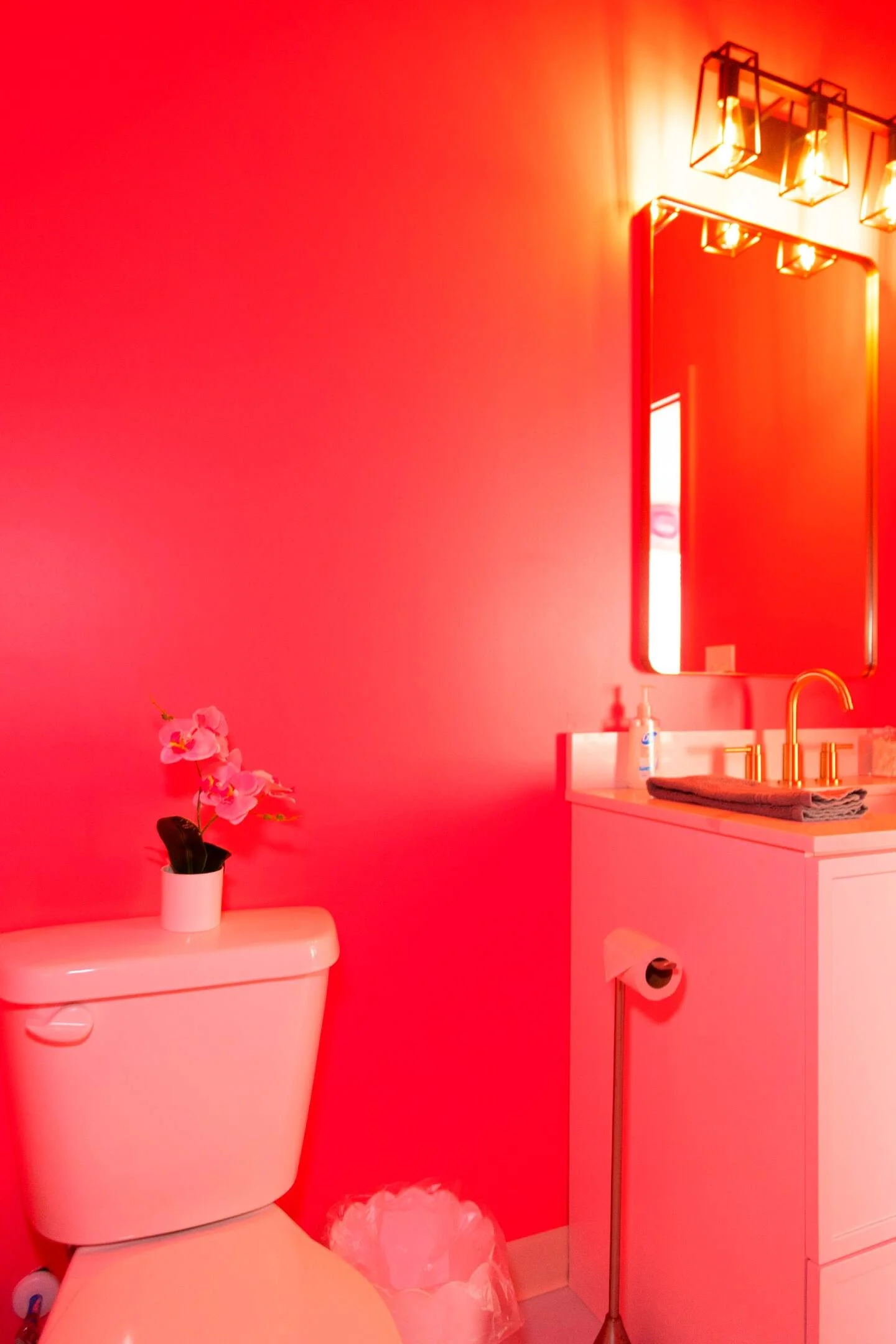
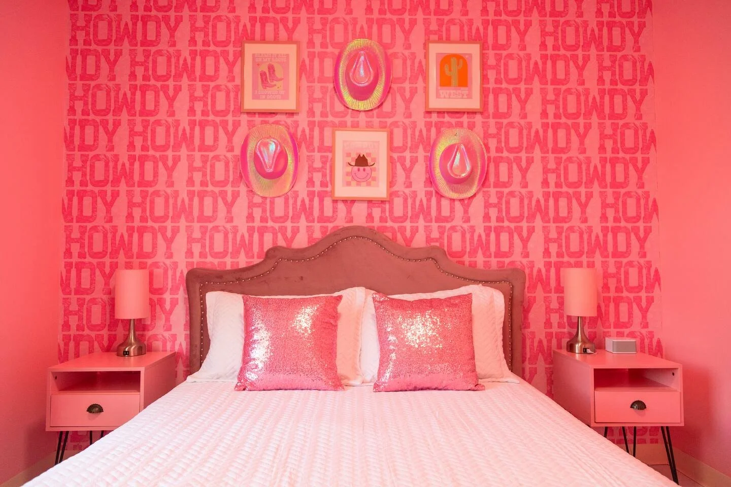
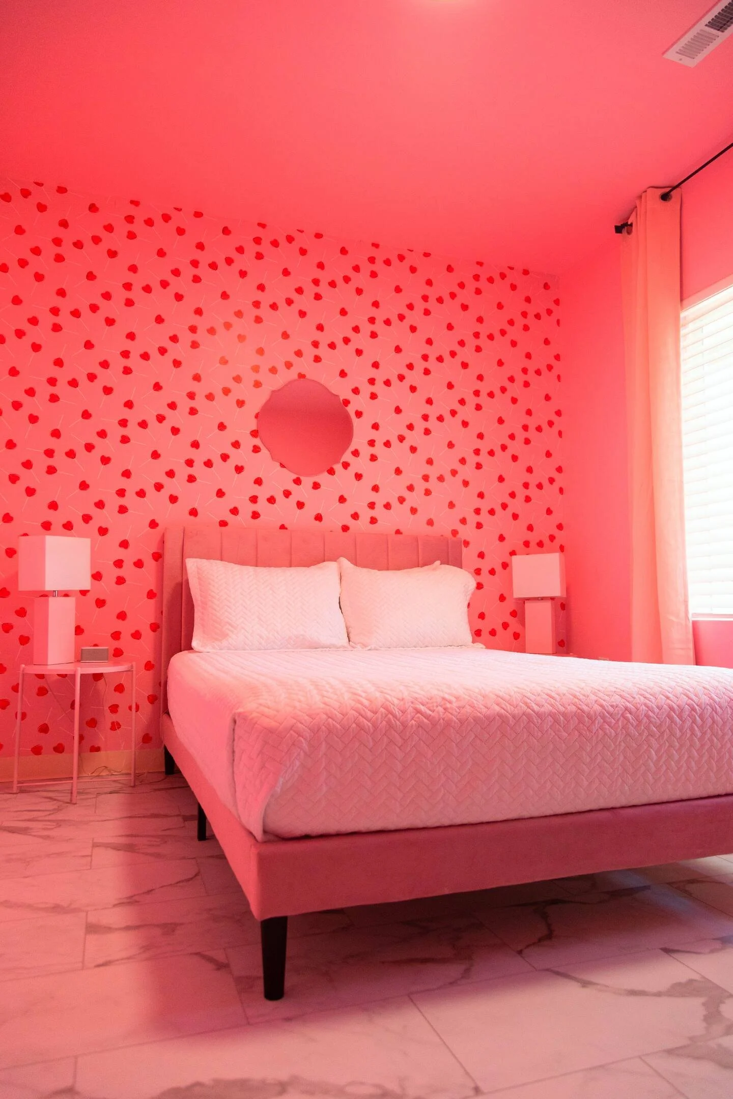
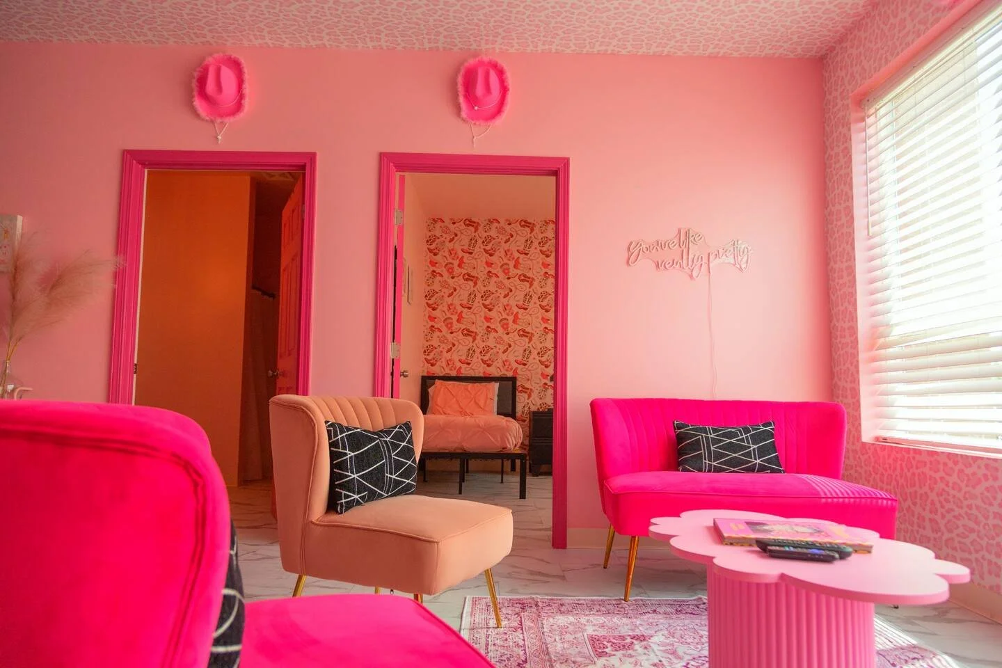
The property was intentionally saturated in pink, positioning the design itself as the primary booking driver. After the initial build, the space was redesigned to push the concept even further by layering in more color, visual drama, and personality to strengthen memorability and market recognition.
This project demonstrates how targeted design can function as a performance asset. Guests choose this property because of the design, not despite it. The space is engineered for instant visual recognition, social sharing, and emotional booking decisions in a highly competitive STR market.
Design Strategy
This home was designed for group travelers seeking a high-energy, celebration-driven stay experience. The target guest profile includes bachelorette parties, girls’ trips, birthday trips, milestone celebrations, and social groups who prioritize fun, visual impact, and shareable spaces over traditional luxury or minimalism.
Market analysis revealed a saturated Nashville STR landscape dominated by neutral palettes and generic interiors, particularly within large-group accommodations. This created a clear opportunity to differentiate through bold visual identity, extreme concept clarity, and hyper-targeted guest positioning rather than attempting to appeal to everyone.
Performance goals were directly tied to booking behavior. The design prioritized:
Instant visual recognition across booking platforms
Scroll-stopping listing thumbnails
Strong thematic consistency for memorability
Social media shareability and content creation
Save, wishlist, and group chat sharing behavior
Market differentiation to support demand-driven pricing
The result is a property that operates as both a themed experience stay and a conversion-driven STR investment asset.

Design Highlights
Design Gallery
A visual walkthrough of Pretty Inn Pink, highlighting the saturated color palette, bold styling choices, spatial layout decisions, and visual identity strategy that support guest experience, listing performance, and market differentiation.
How This Project Was Supported
This project reflects our Design and Setup service, where market insight, guest behavior, and ROI goals guide every decision.
Design is never treated as decoration alone. It is used as a performance tool that supports booking behavior, listing visibility, guest experience, and long-term asset value.